Correlation and Regression
Unit 3
Exercise 1: Covariance and Pearson’s Coefficient
In this experiment, two synthetic datasets are generated to visualize how relationship measures apply. For this particular example, we will study the differences in the covariance and Pearson’s correlation coefficient.
Covariance vs Pearson’s Correlation Coefficient
-
Covariance measures the direction of the linear relationship between two datasets. However, it produces an unbounded measure, meaning large values in the data can lead to very high covariance values that are difficult to interpret.
-
On the other hand, the Pearson’s correlation coefficient measures both the direction and strength of the relationship. Unlike covariance, it produces a bounded measure with values ranging between -1 and 1, making it easier to interpret.
The following example illustrates the differences in interpretability:
# Import necessary libraries
from numpy import mean, std, cov
from numpy.random import randn, seed
from matplotlib import pyplot as plt
import seaborn as sns
from scipy.stats import pearsonr

# Seed random number generator for reproducibility
seed(1)

# Generate synthetic data
data1 = 20 * randn(1000) + 100
data2 = data1 + (10 * randn(1000) + 50)

# Calculate Covariance Matrix and Pearson's Correlation
covariance = cov(data1, data2)
corr, _ = pearsonr(data1, data2)

# Plot the scatterplot
plt.figure(figsize=(8, 6))
sns.scatterplot(x=data1, y=data2, alpha=0.6, edgecolor=None)
plt.title('Scatter Plot of data1 vs data2', fontsize=14)
plt.xlabel('data1', fontsize=12)
plt.ylabel('data2', fontsize=12)
plt.grid(True, linestyle='--', alpha=0.7)
plt.show()

# Summarize results
print(f"Summary of Results:\n{'-' * 30}")
print(f"data1: mean = {mean(data1):.3f}, std dev = {std(data1):.3f}")
print(f"data2: mean = {mean(data2):.3f}, std dev = {std(data2):.3f}")
print(f"Covariance: {covariance[0][1]:.3f}")
print(f"Pearson's Correlation: {corr:.3f}")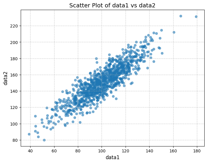
Observations
Both datasets exhibit a positive correlation, as shown by the scatterplot and the positive values of both covariance and Pearson’s correlation coefficient.
However:
- The covariance value (389.755) is difficult to interpret directly due to its dependence on the scale of the variables.
- The Pearson’s correlation coefficient (0.888) provides clearer insight, indicating a strong positive linear relationship between the datasets since it is close to 1.
By normalizing the covariance, Pearson’s correlation makes it easier to assess the strength and direction of the relationship, independent of the data’s scale.
Exercise 2: Linear Regression
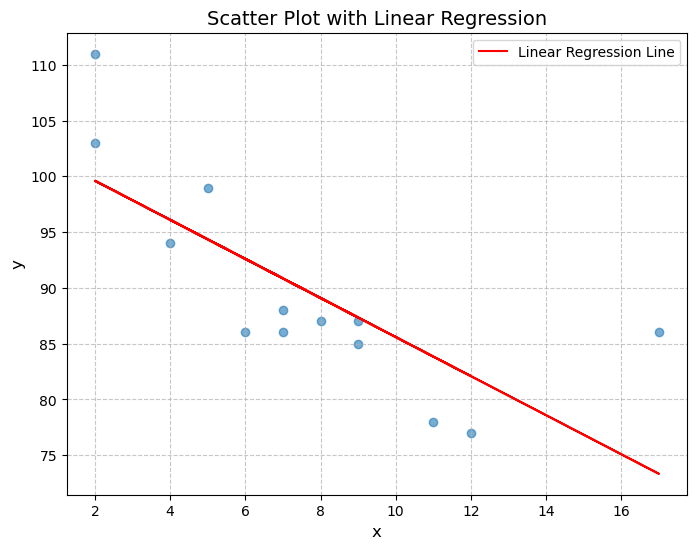
This exercise demonstrates the use of linear regression to identify the relationship between two variables, x and y. By calculating the slope and intercept, the linear regression model establishes a best-fit line that minimizes the distance between observed data points and the predicted values. The Pearson’s correlation coefficient (r) measures the strength and direction of the linear relationship.
In the plotted results, the scatter plot shows the actual data points, while the red line represents the fitted regression line. The exercise also predicts the value for x=10, using the derived regression equation. This process highlights how linear regression serves as a fundamental statistical method to analyze trends and make predictions.
# Import necessary libraries
import matplotlib.pyplot as plt
from scipy import stats

# Define the data for x and y axes
x = [5, 7, 8, 7, 2, 17, 2, 9, 4, 11, 12, 9, 6]
y = [99, 86, 87, 88, 111, 86, 103, 87, 94, 78, 77, 85, 86]

# Perform Linear Regression
slope, intercept, r, p, std_err = stats.linregress(x, y)

# Define the linear regression function
def myfunc(x):
    return intercept + slope * x

# Calculate the predicted value for x = 10
speed = myfunc(10)

# Generate the predicted y values from the linear regression model
mymodel = list(map(myfunc, x))

# Plot the scatter plot and linear regression line
plt.figure(figsize=(8, 6))
plt.scatter(x, y, alpha=0.6, edgecolor=None)
plt.plot(x, mymodel, color='red', label='Linear Regression Line')
plt.title('Scatter Plot with Linear Regression', fontsize=14)
plt.xlabel('x', fontsize=12)
plt.ylabel('y', fontsize=12)
plt.grid(True, linestyle='--', alpha=0.7)
plt.legend()
plt.show()

# Summarize results
print(f"Summary of Results:\n{'-' * 30}")
print(f"Pearson's Correlation: {r:.3f}")
print(f"Linear Regression: slope = {slope:.3f}, intercept = {intercept:.3f}")
print(f"Predicted value for x = 10: {speed:.3f}")
Summary of Results:
------------------------------
Pearson's Correlation: -0.759
Linear Regression: slope = -1.751, intercept = 103.106
Predicted value for x = 10: 85.593